HARMONIZE Explorer
HARMONIZE Explorer is a web platform for the visualization and analysis of Earth observation, health, meteorological and climate data, based on BDC Explorer 3.0. The platform will combine Earth observation data cubes with specific collections tailored for EODCtHRS components (Drone, Health and Climate data). Additionally, it will provide access to Land Use and Land Cover (LULC) classification maps, time-series of vegetation indices (WTSS), and LULC trajectories (WLTS).
With the first version of the web interface online, bugs and suggested improvements were reported, and during the period worked and implemented were implemented. In addition, a new layout for HARMONIZE Explorer based on a draft interface (Mock) was implemented. This implementation took up almost the entire period. Both the implementation and draft were developed on the current version of HARMONIZE Explorer using the HARMONIZE Logo and Branding” material available on the project wiki https://earth.bsc.es/ for composition. Figures below show a set of screenshots with the new layout of the HARMONIZE Explorer platform .
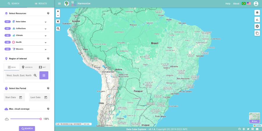
Figure 13 - HARMONIZE Explorer interface.
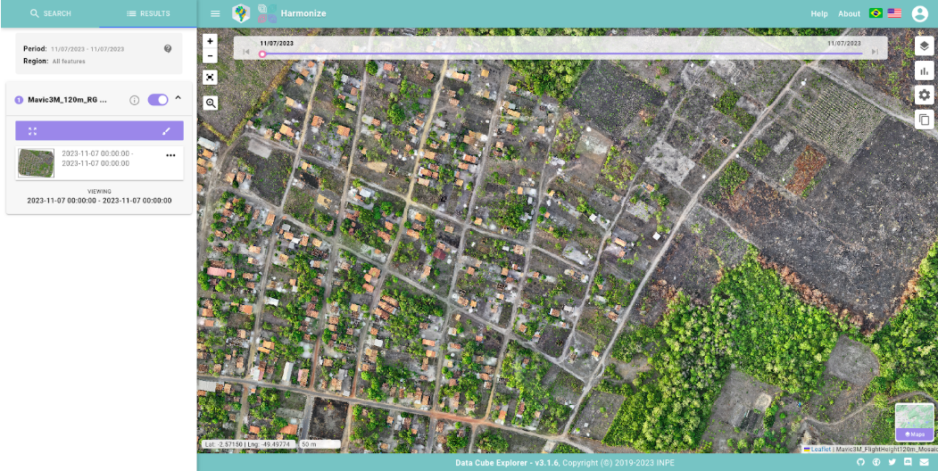
Figure 14 - HARMONIZE Explorer drone mosaic visualization.
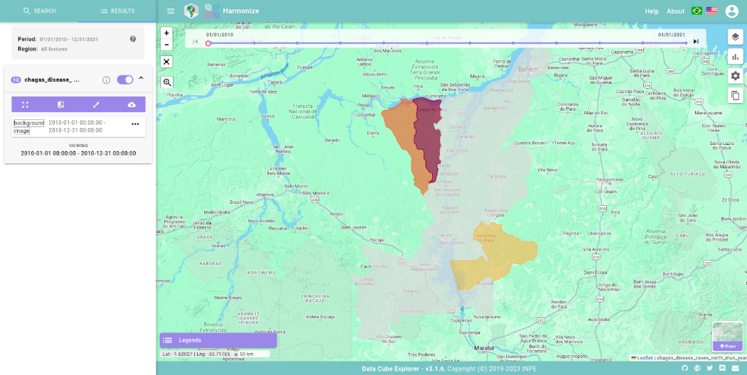
Figure 15 - HARMONIZE Explorer heath data visualization.
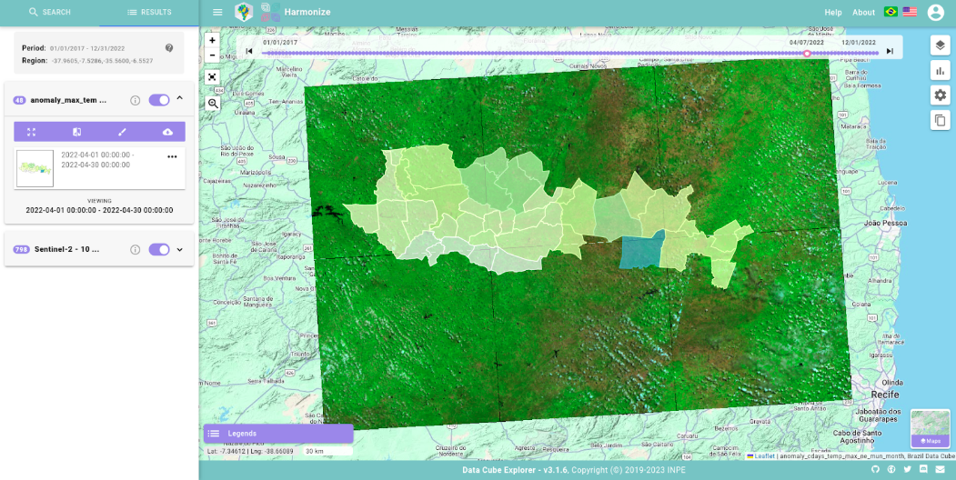
Figure 16 - HARMONIZE Explorer climate data visualization.
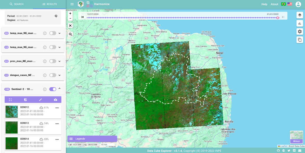
Figure 17 - HARMONIZE Explorer executing search by region
Points cluster feature
During the period, a much-demanded feature was implemented: improving the visualization of the amount of data on the platform. As defined in the platform’s initial requirements, the platform’s actions are (a) search and (b) download. To improve the visualization of drone data, we decided to display the number of available drone images on the Map by using centroids of the features and to display the number of points available using a cluster component.
This feature was implemented using the centroids of the features in the image collections (drone images), so each drone image appears as a point when the user clicks on the view button with the cluster activated. The button to activate the point visualization is located between the name of the image collection and the information button, as shown in Figure below.
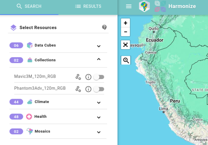
Figure 18 - Points cluster visualization button.
When it is activated, a flight is made in the direction of the region where the data is located and the points of each of the images available in this Drone collection are drawn, as shown in Figure below.
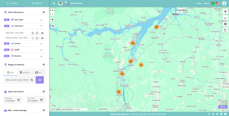
Figure 19 - Drone image markers cluster in HARMONIZE Explorer.
When you change the zoom, the clustering of the points is recalculated, creating new clusters that decrease or increase the number of points per cluster. The more points there are in a cluster, the more orange the point is, and the fewer points there are in a cluster, the more green the point is. Zoom in on a campaign with clustering activated by der is presented in Figure below.
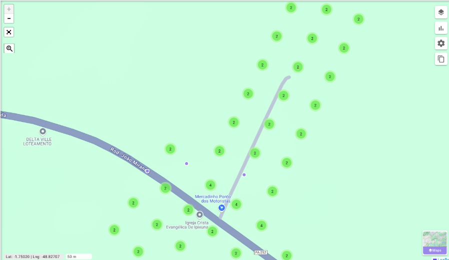
Figure 20 - Zoom on drone image markers cluster in HARMONIZE Explorer.